Image zoom
I’ve included medium-zoom to all relevant images on this site so you could click images to zoom in on them if needed. On mobile, this may work unreliably, but you can always open the image itself on a new tab (or simply save it) as a fallback. Just another quality-of-life update for desktop users like myself.
There are some nuances with medium-zoom and Quartz 4 itself, though. Since the latter is using some quirky SPA code, it clears the CSS injected by medium-zoom on navigation. Right now, the workaround I did was to simply “hardcode” the injected CSS into custom.scss. Since class names are static, this helped fix the flakiness of the image zoom functionality across navigation.
Gallery layouts
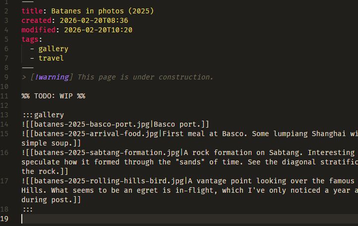
I’ve also leveraged remark-directive to provide a custom :::gallery directive for me to organize pictures in a two-column (single-column on mobile) layout for pages dedicated mostly to images. The gallery for our 2025 Batanes trip is what I used to test this out on.
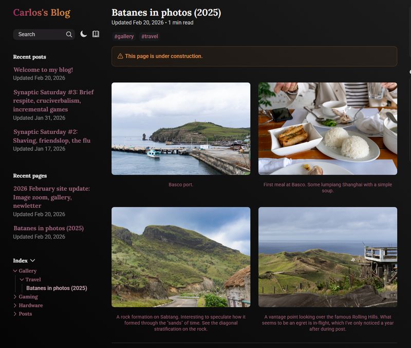
This two-column setup for photos above is itself, a gallery! Well, not really a gallery, but a gallery.
Later down the line, I might consider a masonry-style layout for images with differing aspect ratios.
Newsletter
I've disabled this feature for now.
follow.it looks like shit after testing, so I’m not going to use it for now. I’ve disabled the logic but I’ll be keeping the discussion here for archival.
You’ll notice that there’s a new form on the right-hand side of the page (on mobile, at the bottom of the page, but it’s still styled like shit):
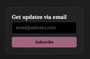
Now, this isn’t as good as Substack or other newsletters you may subscribe to. I could definitely code up a newsletter server to do it and have full control; but this is just for friends who’d like to be notified via email. This is powered by follow.it, and it’s totally free on my end, so if you prefer that channel, here you go.
AWS S3 migration, size optimization
For more details, you can refer to this commit here. I’ve finally started migrating some files (all of the images, mostly) to AWS S3. They all should be hosted under cdn.carlospanganiban.com and all <img> and so tags are routed to said CDN domain.
Rationale
As I was writing the gallery for the Batanes trip, I quickly realized that the photos are taking up around 10-20MB each. With around thirty photos, one would expect downloading half a gigabyte of data just by visiting the page alone. Which isn’t ideal particularly if you’re using a metered internet connection.
S3 and href redirection
Obsidian has built-in tech where it could automagically find where the file is when you do a wikilink (e.g. [[my-image.jpg]] will route it to whatever/path/here/my-image.jpg). Quartz 4 isn’t that smart though, so I have a recursive script (generate-manifest.ts) that generates a base filename-to-path mapping of each file to its absolute path in reference to content/.
I cannot do this on-the-fly (e.g. generate the map on GitHub Actions) since the files (i.e. the large files) simply do not exist anymore on the repo. Quickest fix here was to just include a assets-manifest.json that gets pre-compiled before pushing.
The above makes the S3 bucket sync simpler, as it provides a 1
path-to-bucket-path route for each asset.href attributes are then simply replaced with cdn.carlospanganiban.com/blog/assets/<path here>
medium-zoom and thumbnails
Finally, I have another script generate-thumbs.js which uses sharp to resize (to a max width of 800 px) and compress images and put them under the thumbs/ directory. With the same href replacement logic above, the full-res images still stay as assets/images, but thumbnails are now at assets/thumbs.
With medium-zoom, I can simply set data-zoom-src to the full-res source and it automatically lazy-loads it for me.